Posts will be posted here from now on http://cappagames.wordpress.com/
Category Archives: Blogging
Update: On Seagull Hunt and a Little Suprise
Sorry for the lack of posts lately, we’ve been hard at work…but not on Seagull Hunt! We decided to take a break on Seagull Hunt and work on a pong styled game. But this is no ordinary pong game! I will be able to talk more about it in the coming weeks.
Minecraft creator makes “Minicraft” for Ludum Dare 22
Markus Persson, also known as Notch, has made a smaller version of Minecraft called Minicraft. It’s basically a 2D version of Minecraft. It was made for the 48/72 hour competition Ludum Dare 22. It’s amazing what he accomplished in such a short time period.
Want to try it? Your in luck. You can play it HERE for FREE. You may need to download Java in order to play it.
Or you can just take a look below.
Pixel Art: The Evolution of Seagull Hunts Background Part 2
Just when I thought I was done, new problems arise. It’s interesting how different problems become noticeable over time.
The major problem was that it looked too flat and 2 dimensional. After some thinking, testing and experimenting, I began to see the solution. So lets start where we left off.
1. The building in this background looks so…flat. I couldn’t figure out what to do, but then I remembered that shading is what gives something depth.
2. There we go! All that was needed, was a darker shade of the middle color on the bottom and a lighter shade of the middle color on top.
3. Here I did the same thing to the middle column coming downwards. I also added a shadow to it at the top, on the right side of it.
4. The big change here is the sky. I think it makes everything look more vibrant. I started with a darker blue at the top and gradually made it lighter, about every 19 pixels.
Here’s a side by comparison:
Before
After
It’s subtle difference, but makes a big difference overall. The only question now: “Is it finished?”
Pixel Art: The Evolution of Seagull Hunt’s Background
Update: Some of the photos look weird because of the cropping WordPress does. Click the picture for the original size.
I finally finished the background for Seagull Hunt. I spent far too long on it…probably 25 hour’s, but there was a LOT of learning happening. So I decided to go over the evolution of the background and explain what I learned.
 1. The first step I took was designing the car. I was having trouble at first, but then I learned two important lessons:
- Using reference art helps out amazingly.
- When making something symmetrical, make half of it, copy, flip and paste. This saves time and looks better.
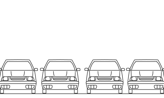
2. Now I pasted 3 more car’s and lined them up on the ground to make a rough outline of what I wanted the background to look like.
3. After testing it out in the game, it became obvious that the cars were taking up too much space. So I simply lowered everything on the background.
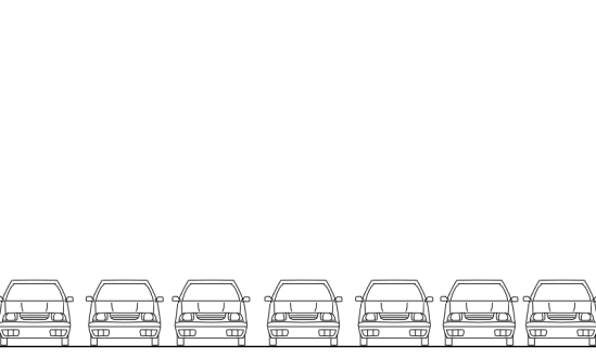
4. Lowering them wasn’t enough, so I needed to shrink them all down, for a total of 7 cars.
5. Next, I needed to color the cars in. This was challenging, but fun. It took me 2-4 hours to do, but now I could probably get it done in an hour or less.
6. After the first car was done, I copied it and pasted it over the rest of the cars.
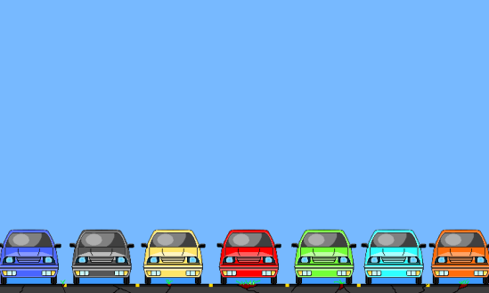
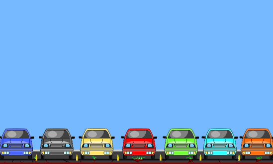
7. Here was a big update! Seven red cars didn’t look right, so I decided to give them all different colors. Thankfully it didn’t take as long as the first car. In fact, I probably got all of them done somewhere between 30-60 minutes. Also, I made the background blue and added the pavement. The pavement was frustrating. It just didn’t look right. It took me a while until I was happy with it.
8. I added some soil to try and improve it. It looked better than before, but I still wasn’t happy.
This could have been the final background, as we were planning on releasing the game soon for a competition. Thankfully we decided to make the game right, rather than rush it out.
9. Now that we had more time, I decided to give it another shot. Now I was starting to get a better idea of what to do. I added the parking lines and curbs. Still something was missing…
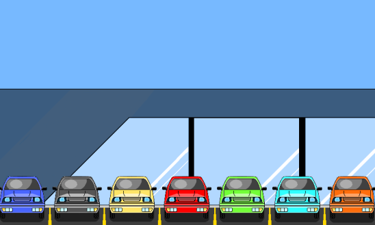
10. Aha! It needed a building. It might look simple, but it took a while to figure out the skeleton of the building.
11. Another big update. Where to start…
- Pavement: Previously, the ground had a 2D look to it. This didn’t look right with the new building and parking lines, so I scrapped it. Instead I gave it a more 3D look to it. The lines were backwards in the previous version, so I fixed that as well.
- Car Shadows: A small touch, but it looks much better.
- Building Color: I liked the color so I went with it.
- Windows: This is one of those things that took forever to figure out, but had such a simple solution. I couldn’t figure out how to do it, so I did what anybody else would have done in my position, watch a speed run of TMNT 2 for the NES. Don’t judge yet, it was work related, I swear! While I was thinking about this problem I had flashbacks from childhood of level 2 in the game when your walking by stores with windows. Sure enough, there was a window with shredders ugly face all over the T.V. Thanks TMNT 2, your still giving after 20+ years.
12. We need the cars to be equally spaced for the hit boxes, so I had to reposition them. It took some extra work, but it was worth it. Not just for the hit boxes, but it looks better too.
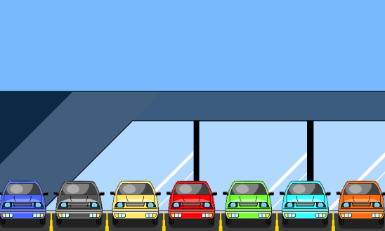
13. Here I added more of the white lines across the windows, and changed the color. In addition, I added another color to the building.
14. Here’s where the unhealthy obsession started to kick in. See the bottom white line on the first window? I lowered that because it wasn’t equal to the rest. And I added a 3rd color to the building at the top left. This was the final build…or so I thought!
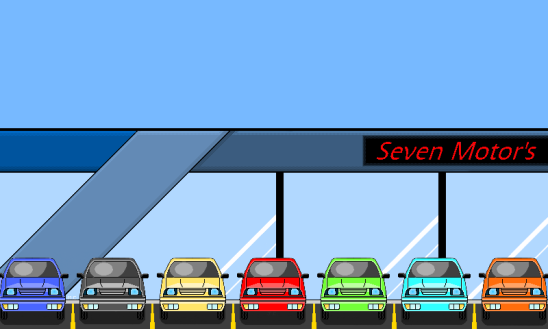
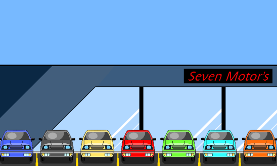
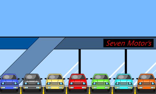
15. The building needed a name. It took a while, but I finally settled on seven.
16. I made the top black line thicker and the right black column between the windows smaller, to equal the left one.
17. I was just looking at the picture late at night when I got an idea. Earlier I had wanted to add a company symbol, but couldn’t think of any. Than it hit me. I will make a seven on the left side of the building.
18. I couldn’t see the seven that well, so I changed the colors up a bit.
19. During a meeting it was suggested to make the black spot glass. I liked the idea and did it immediately. I also added some black lines to make the seven look better.
20. And the final thing I changed was the sign. I extended it to the edge of the screen. Finally it’s done.
It was a long process, but I learned a lot. Here’s some of the lessons I learned:
- Save often and when you do, make another copy. This allowed me to be flexible and served as a backup. It also allowed me to do make this post.
- Don’t be afraid to experiment. Most of the progress I made, was because I tried things out.
- Don’t give up. The first Background I did was horrible (not in this post and completely different). Now while this might not be the best background ever, it was my first (err second) and I’m really happy with it.
I hope this post was helpful and entertaining for you. Now I’ll leave you with a gif of the progress.
P.S. It took forever to get this gif to work. The solution was to make the original gif the proper size so WordPress doesn’t auto crop it. In this case it was 549 by 329.


