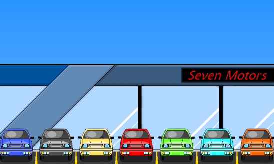
Just when I thought I was done, new problems arise. It’s interesting how different problems become noticeable over time.
The major problem was that it looked too flat and 2 dimensional. After some thinking, testing and experimenting, I began to see the solution. So lets start where we left off.
1. The building in this background looks so…flat. I couldn’t figure out what to do, but then I remembered that shading is what gives something depth.
2. There we go! All that was needed, was a darker shade of the middle color on the bottom and a lighter shade of the middle color on top.
3. Here I did the same thing to the middle column coming downwards. I also added a shadow to it at the top, on the right side of it.
4. The big change here is the sky. I think it makes everything look more vibrant. I started with a darker blue at the top and gradually made it lighter, about every 19 pixels.
Here’s a side by comparison:
Before
After
It’s subtle difference, but makes a big difference overall. The only question now: “Is it finished?”


